Data manipulation and visualisation
Marine Ecosystem Dynamics
Plan for today’s lecture


- Introduction to
tidyverse - Pipe the data using
magrittr - Clean the data using
tidyr - Arrange the data using
dplyr - Plot using
ggplot2
Tidyverse
tidyverseis a collection of packages- It is now a standard in data analysis
- It is easier to read and keep track of what is happening with the pipe operator
%>%
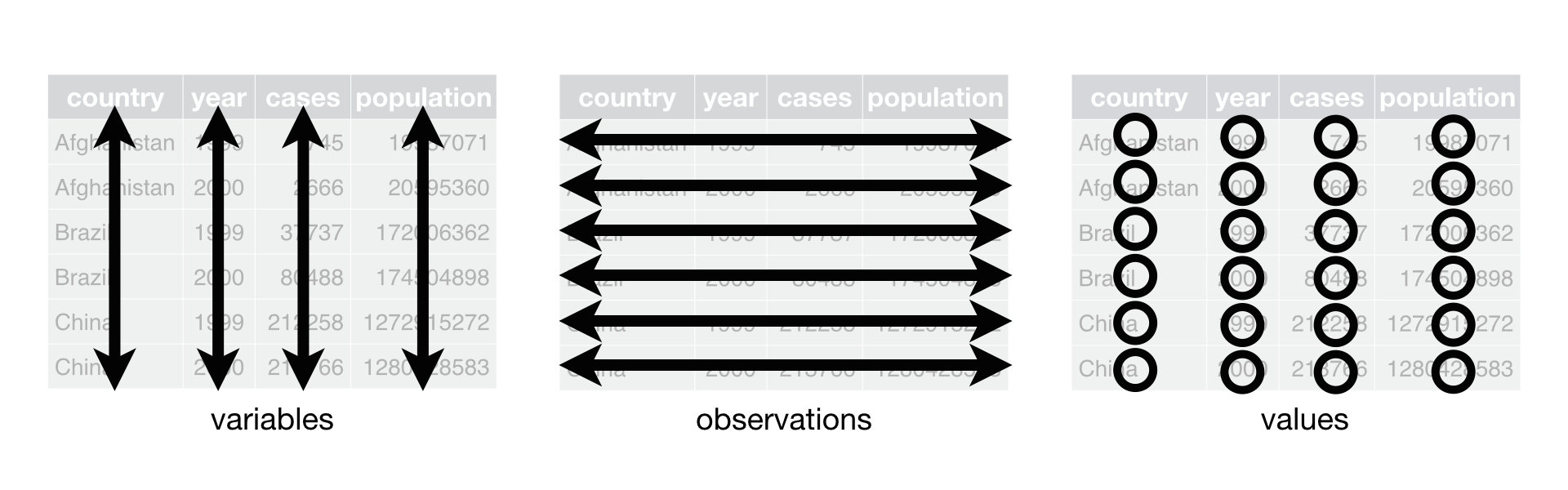
Tidy the data with tidyr
A table is tidy if:
- Each variable is in its own column
- Each observation is in its own row
Key functions:
pivot_longerpivot_wideruniteseparate
Data visulalisation
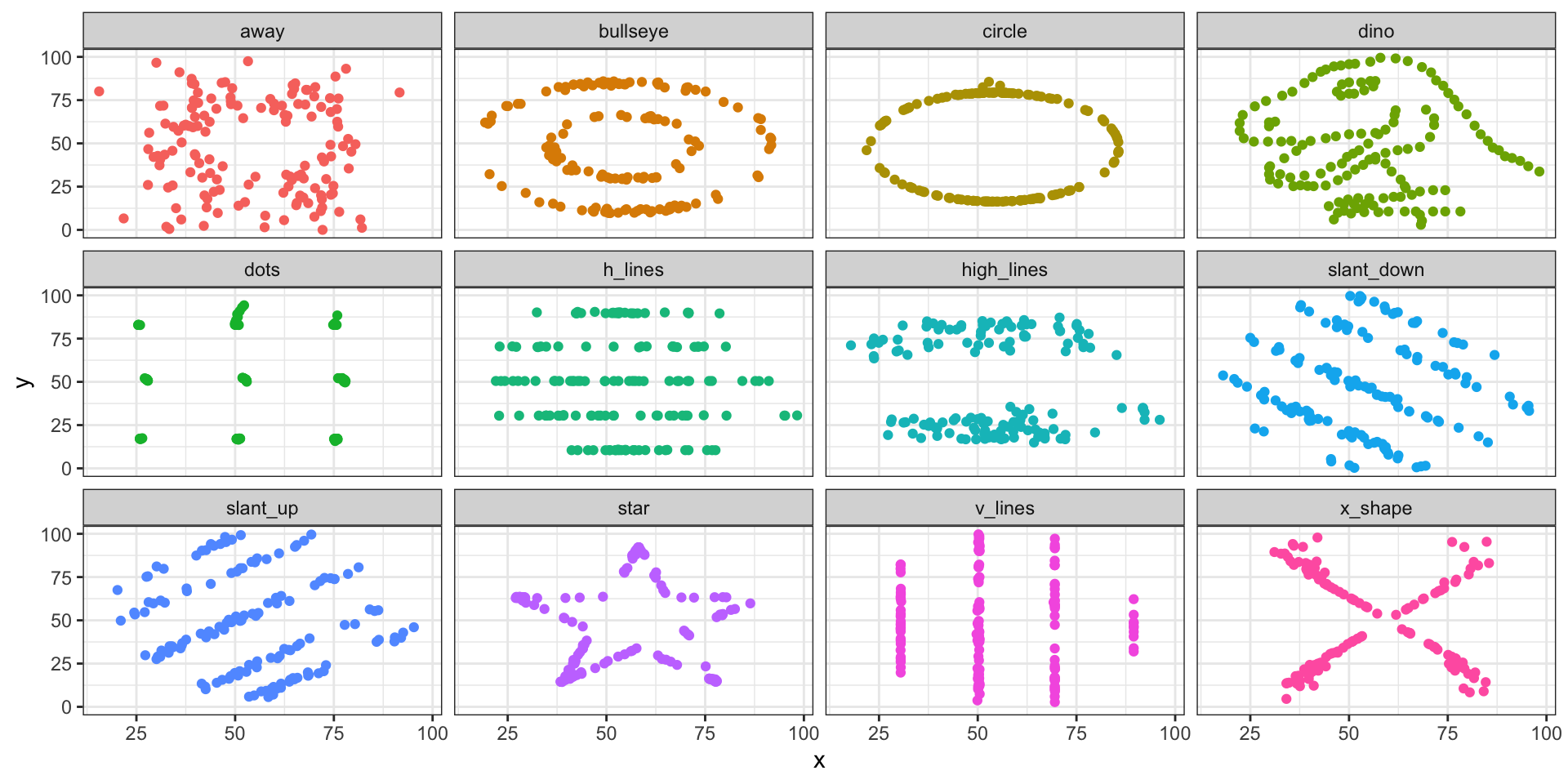
It is very important to look at the data. Totally different data might have similar statistics…
| statistics | value |
|---|---|
| mean_x | 54.27 |
| mean_y | 47.83 |
| sd_x | 16.77 |
| sd_y | 26.94 |
Visualise the data with ggplot2
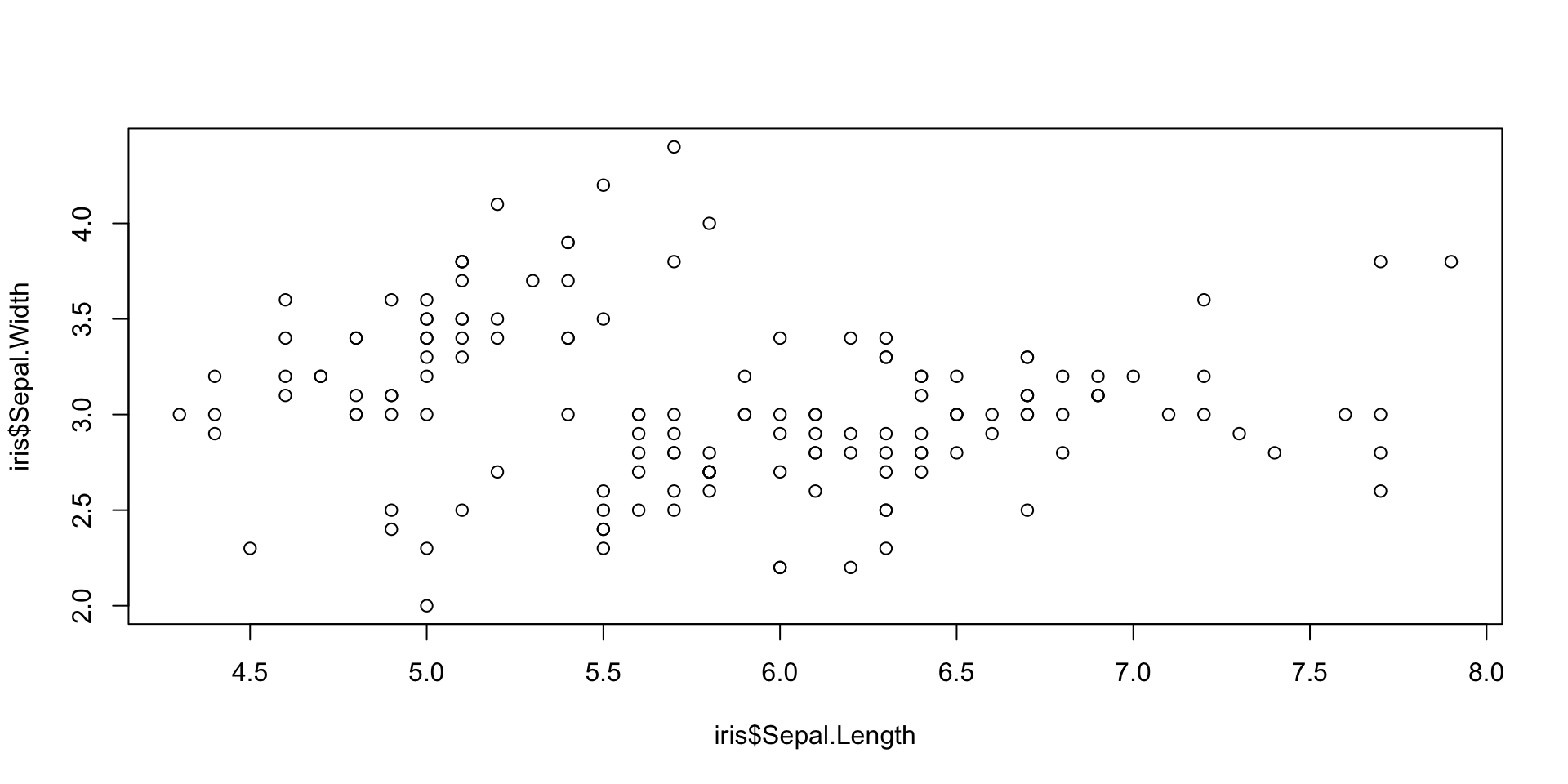
Visualise the data with ggplot2
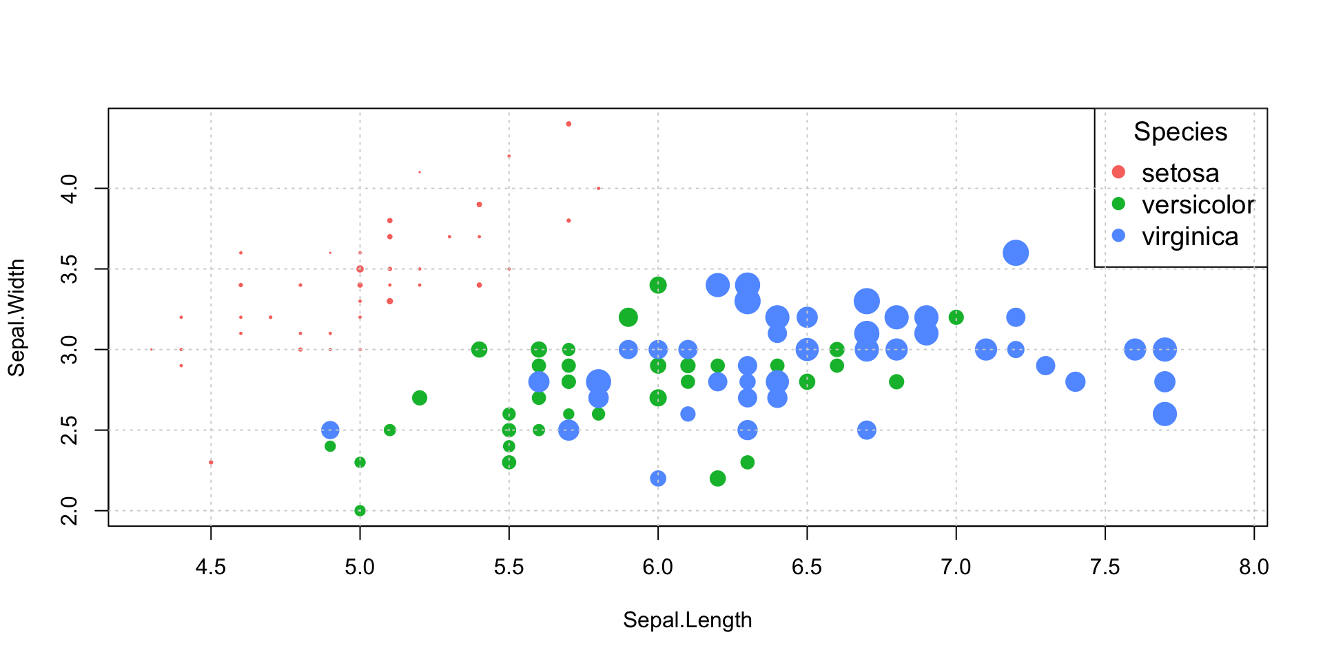
species_palette <- c("#F8766D", "#00BA38", "#619CFF")
size_vector <- iris$Petal.Width
plot(x = iris$Sepal.Length,
     y = iris$Sepal.Width,
     col = species_palette[iris$Species],
     bg = species_palette[iris$Species],
     pch = 21,
     cex = size_vector,
     xlim = c(min(iris$Sepal.Length), max(iris$Sepal.Length)),
     ylim = c(min(iris$Sepal.Width), max(iris$Sepal.Width)),
     xlab = "Sepal.Length",
     ylab = "Sepal.Width")
legend("topright", legend = levels(iris$Species), col = species_palette, pch = 21, pt.bg = species_palette, cex = 1.2, title = "Species")
grid(lwd = 1, lty = "dotted")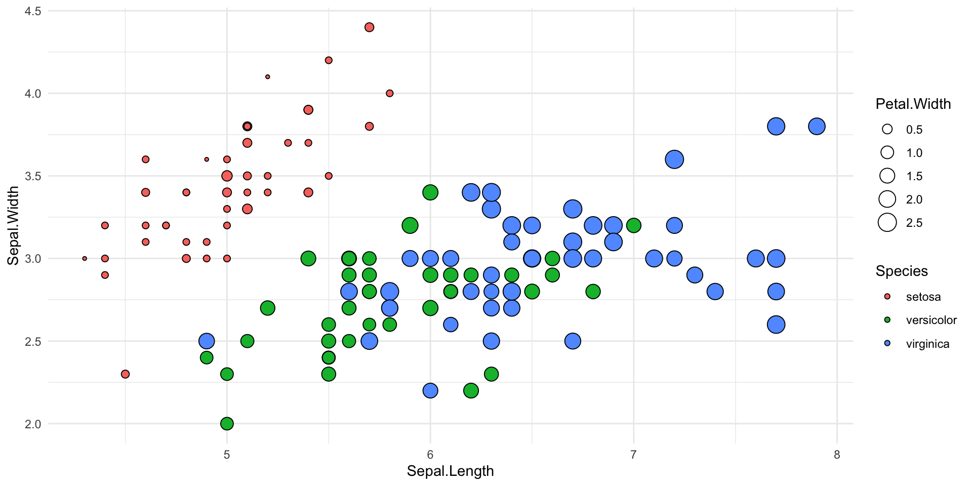
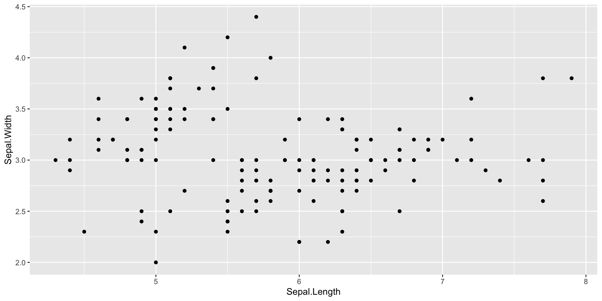
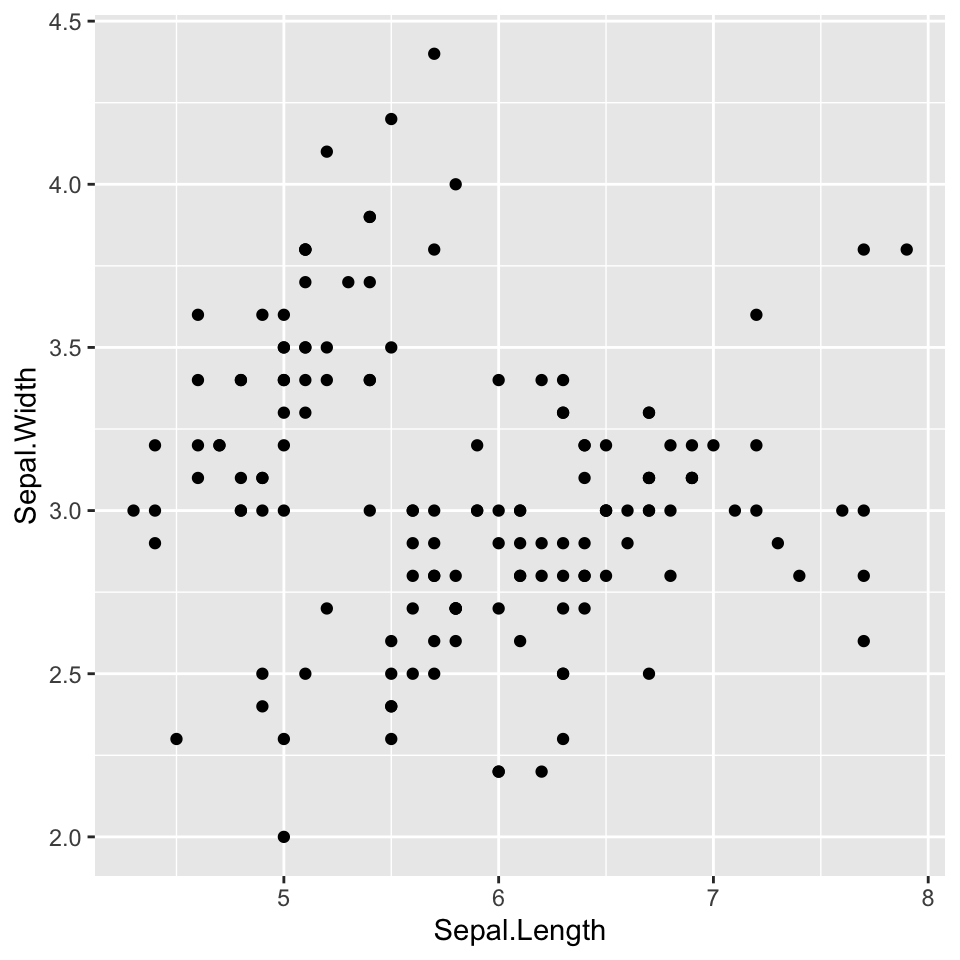
Let’s plot using ggplot2 - Data

Let’s plot using ggplot2 - Aesthetics
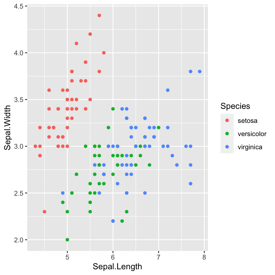
Let’s plot using ggplot2 - Geometry
Let’s plot using ggplot2 - Geometry
Let’s plot using ggplot2 - Statistics

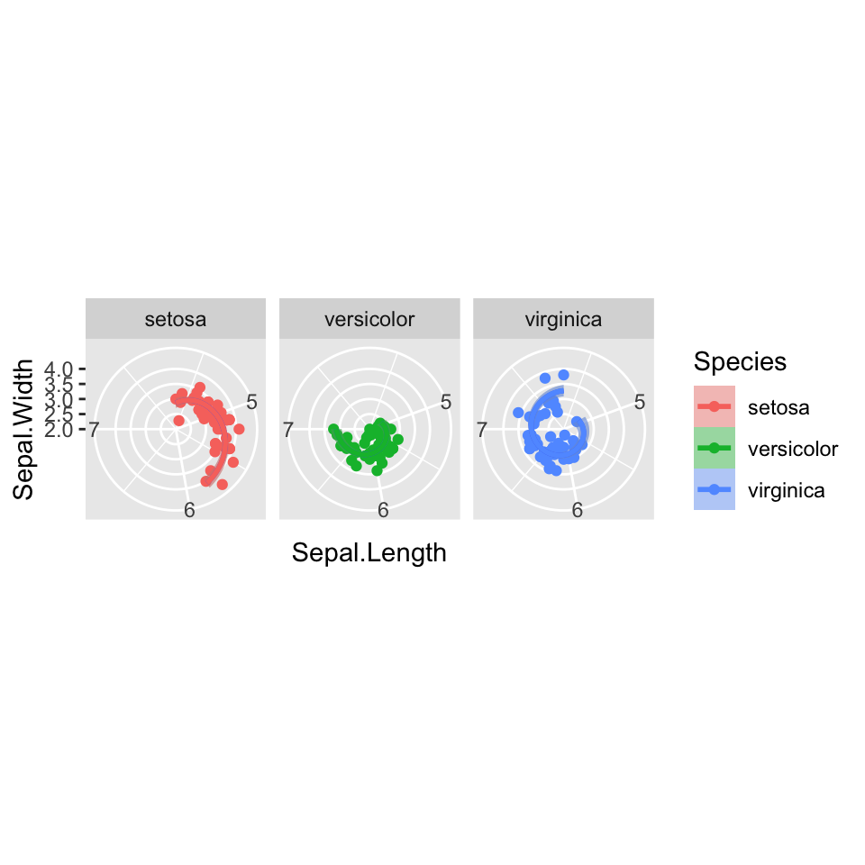
Let’s plot using ggplot2 - Facets

Let’s plot using ggplot2 - Coordinates
Let’s plot using ggplot2 - Themes

Let’s plot using ggplot2 - Themes
ggplot(data = iris,
       mapping = aes(x = Sepal.Length,
y = Sepal.Width)) +
geom_point(mapping = aes(col = Species)) +
stat_smooth(method = "lm") +
stat_smooth(method = "lm",
mapping = aes(col = Species,
fill = Species)) +
facet_wrap(~Species) +
coord_polar() +
theme_light() +
theme(axis.line = element_line(color = "red"))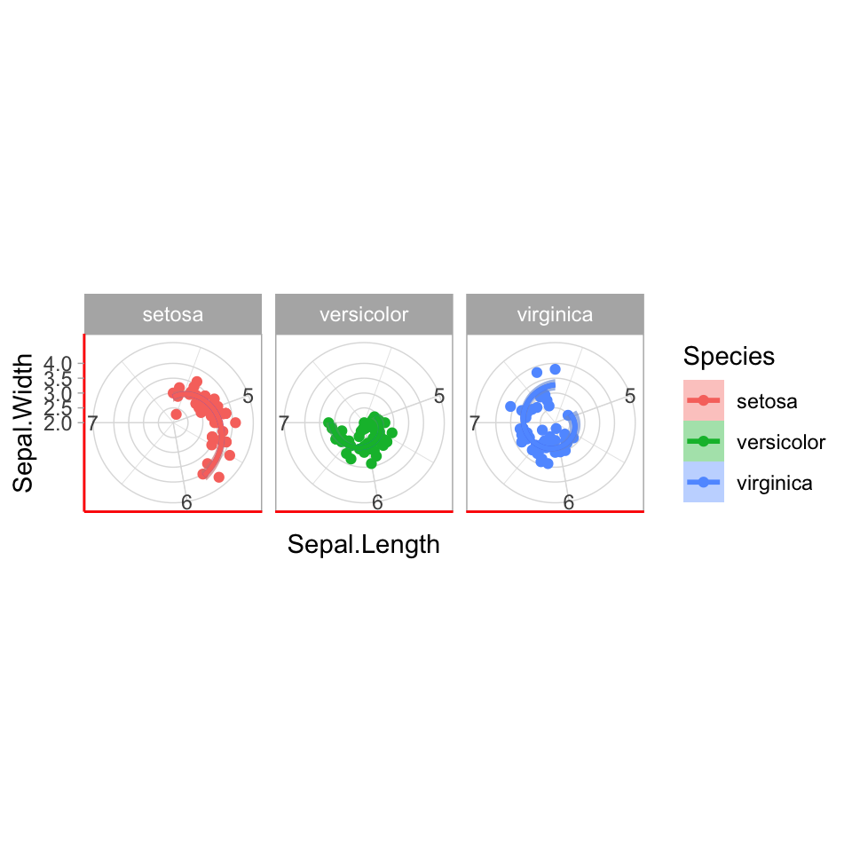
Let’s plot using ggplot2 - Themes
ggplot(data = iris,
       mapping = aes(x = Sepal.Length,
                     y = Sepal.Width)) +
geom_point(mapping = aes(col = Species)) +
stat_smooth(method = "lm") +
stat_smooth(method = "lm",
mapping = aes(col = Species,
fill = Species)) +
facet_wrap(~Species) +
coord_polar() +
theme_light() +
theme(axis.line = element_line(color = "red"),
strip.text = element_text(size = 13, color = "pink"))
Let’s plot using ggplot2 - Extra tips
ggplot(data = iris,
       mapping = aes(x = Sepal.Length,
                     y = Sepal.Width)) +
  geom_point(mapping = aes(col = Species)) +
  stat_smooth(method = "lm") +
  stat_smooth(method = "lm",
              mapping = aes(col = Species,
fill = Species)) +
facet_wrap(~Species) +
coord_polar() +
theme_light() +
theme(axis.line = element_line(color = "red"),
strip.text = element_text(size = 13, color = "pink")) +
labs(title = "Sepal", x = "Length" , y = "Width", subtitle = "relationship between width\nand length", caption = "Caption appear here")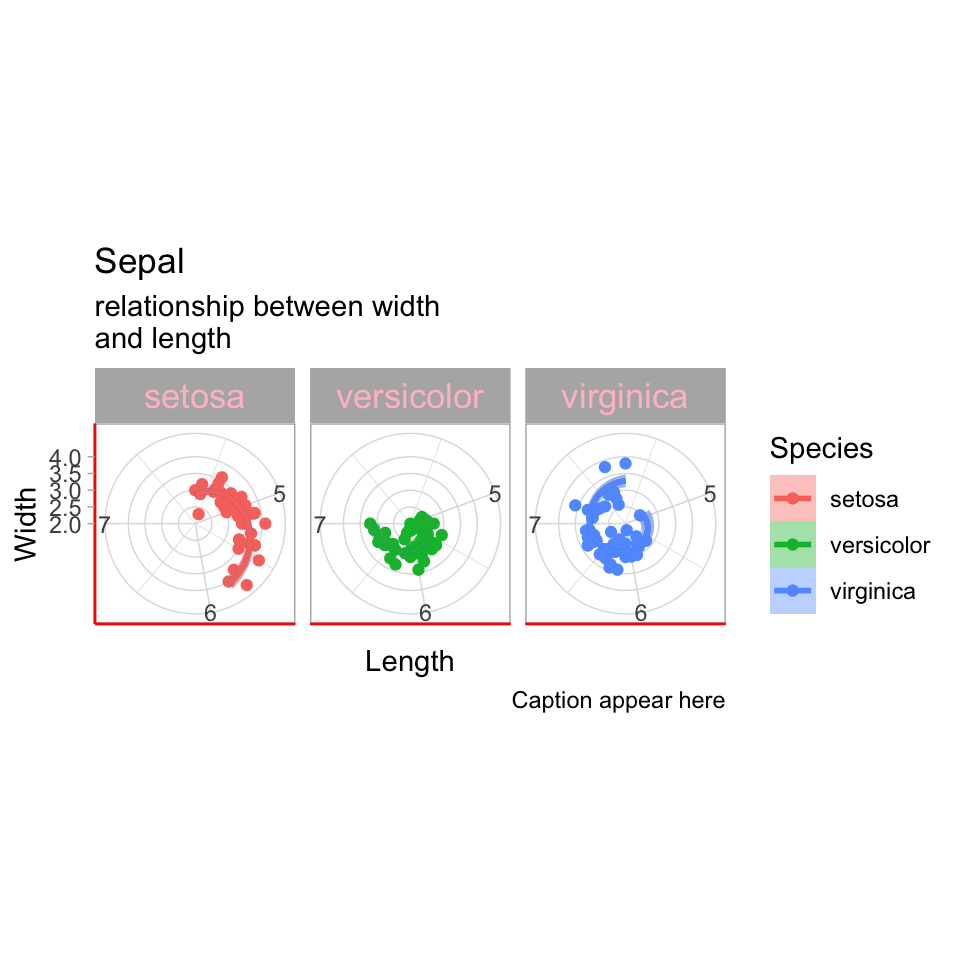
Let’s plot using ggplot2 - Extra tips
ggplot(data = iris,
       mapping = aes(x = Sepal.Length,
                     y = Sepal.Width)) +
  geom_point(mapping = aes(col = Species)) +
  stat_smooth(method = "lm") +
  stat_smooth(method = "lm",
              mapping = aes(col = Species,
                            fill = Species)) +
facet_wrap(~Species) +
coord_polar() +
theme_light() +
theme(axis.line = element_line(color = "red"),
strip.text = element_text(size = 13, color = "pink")) +
labs(title = "Sepal", x = "Length" , y = "Width", subtitle = "relationship between width\nand length", caption = "Caption appear here") +
scale_color_manual(values = c("forestgreen", "firebrick", "burlywood"))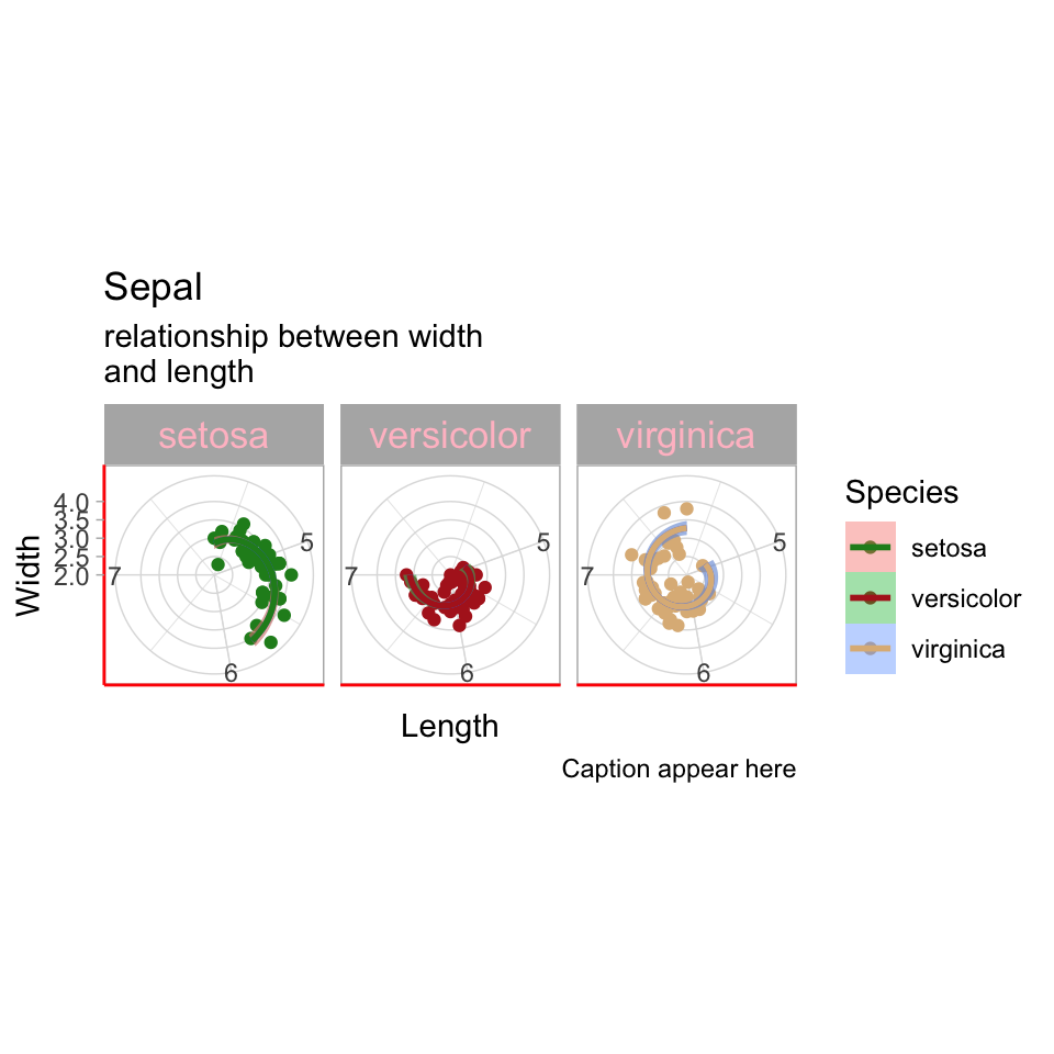
![]()